Background
Metagenics partners with healthcare practitioners to help patients acheive better health outcomes through nutrition. As more and more patient care is being conducted online, Metagenics embarked on the mission to digitize the prescription experience with the goal of improving the physician-to-patient experience through best-in-class digital solutions.
Problem
Metagenics needed a new approach to facilitate physician-to-patient prescriptions for nutritional supplements. The existing B2B2C ordering platform allowed patients to purchase products from their physician, but lacked functionality for physicians to initiate protocols for their patients.
Solution
Our goal was to create SaaS platform focused on enabling physicians to create and send nutritional supplement prescriptions to their patients. Physicians could then track patient adherence and monitor health outcomes.
Role
I was the lead designer responsible for end-to-end design and execution.
Deliverables
Customer feedback
User personas
Planning objectives
Site map
User flows
Desktop designs
Mobile designs
Impact & outcomes
Design process
In order to set forth a phased approach for delivery to stakeholders, I developed a high-level outline of the design team's process methodology. This allowed the greater product team to level-set expectations for delivery of required design artifacts.
01. Discover
Gather user feedback, define user personas, and identify clear user needs.
02. Plan
Establish specific and measurable objectives and plan project scope.
03. Architect
Map out content architecture and user flows that achieve business objectives.
04. Design
Develop high-fidelity prototype designs for desktop and mobile expereinces.
Gathering feedback
In order to understand the challenges, the design team gathered feedback from our customer support teams and conducted user interviews with trusted physician partners to get a holistic understanding of customer needs. Once all relevant data was compiled, I led the design team in workshops to categorize this feedback and tally up the total number of participants who shared similar user needs.


Defining our users
Once we gathered and categorized our customer feedback, I then translated the results into our initial user persona for MVP. This persona would then be used as our benchmark to vet proposed functionality to include in our initial product shipment.
Physician persona
"I need a digital solution to create nutritional supplement prescriptions for my patients that allows them to easily view, edit, and checkout with the products I recommend."
"I'm a physician on the go. I conduct a significant portion of my pateint care on my phone or tablet alongside my patients in real time."
"I want to be able to monitor my patients and track adherence by seeing a list of all nutritional prescriptinos I've made and whether my patients have filled them."
Problem
Physicians need a digital and streamlined solution to better provide nutritional care for their patients. Currently product recommendations are made in an analog format which results in a lack of transparency and adherence.
Strategy
We will focus on a mobile-first experience to meet Patricia's goals of digitally prescribing nutritional suppplements and staying on top of patient adherence.
Patient persona
"I need a better way to receive nutritional product prescriptions from my doctor with clear instructions."
"I use my phone for my everyday tasks. I want to be able to purchase products when I'm on the go."
"I want autonomy to be able to customize the products my physician prescribes."
Problem
Patient need a digital and streamlined solution to better receive nutritional subsciptions from my physician. The existing process is not condusive to the increasing trend of mobile ecommerce.
Strategy
We will focus on a mobile-first experience to meet Robert's goals of receiving nutritional product subscriptions online.
Planning our objectives
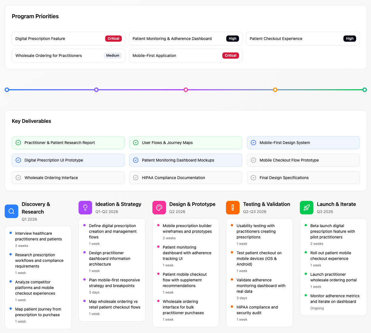
To set forth a tactical project plan, we created user stories that translated customer feedback into actionable objectives. These stories focused on specific tasks and goals, providing a clear framework for the design process and ensuring our solutions addressed real user needs.
Mapping it out
After we had a good sense of our user needs, along with project requirements, I got to work on building out a site map of the platform experience. I started with the physician back office experience, mapping out all necessary screens to best meet customer needs. From there, I built out the product recommendation and patient checkout flows to complete the overall experience.

Getting into the flow
For physicians, creating digitial prescriptions was a critical function for their practices. Due to the busy nature of a physician's day-to-day, this process needed to be simple and easy to follow. Users needed to quickly browse/search products and determine the daily dosage/times per day their patients should take each product, along with providing additional notes regarding their recommended protocols.

Designing the desktop
After establishing the user flow for creating prescriptions, I began to design the desktop screens for the physician back office experience. I leveraged our internal design system and brand guidelines to establish the overall look and feel, applying our colors, font families, and layout. My approach was to create a clean and clinical interface that was intuitive to navigate.
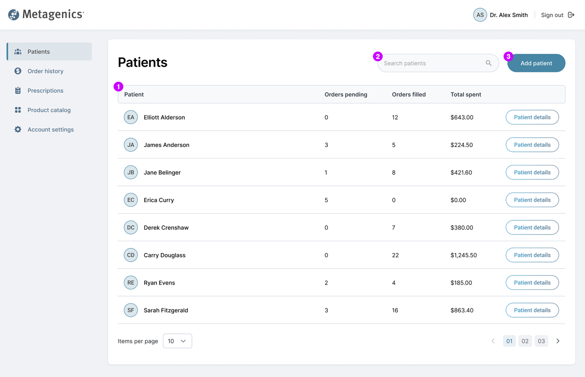
Patient list
1Physician can view full list of patients, along with high-level metrics. "Patient details" allows them to drill in for more information.
2Physician can easily search patients by name.
3Physician can click "Add patient" to add new patients.
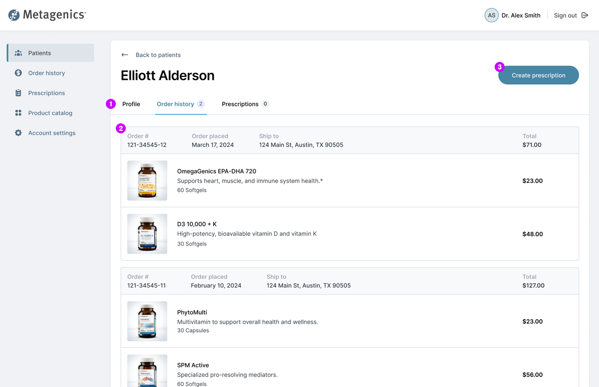
Patient details
1Tabs allow physician to view profile info, order history, and prescriptions.
2Physician can view all products purchased by the patient.
3Physician can click "Create prescription" to initiate a new prescription for the patient.
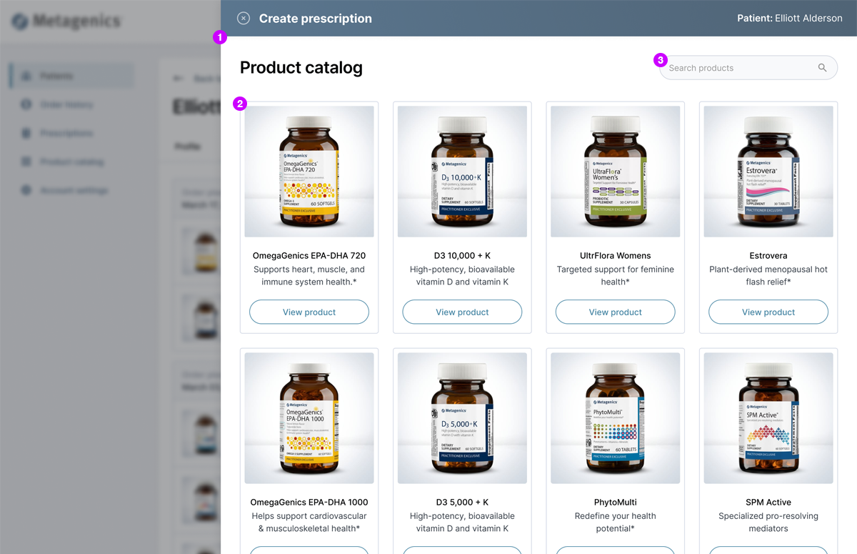
Product list
1Flyout keeps the user focued on creating the prescription.
2Physician can browse all products in catelog.
3Physician can search products to quickly add to prescription.
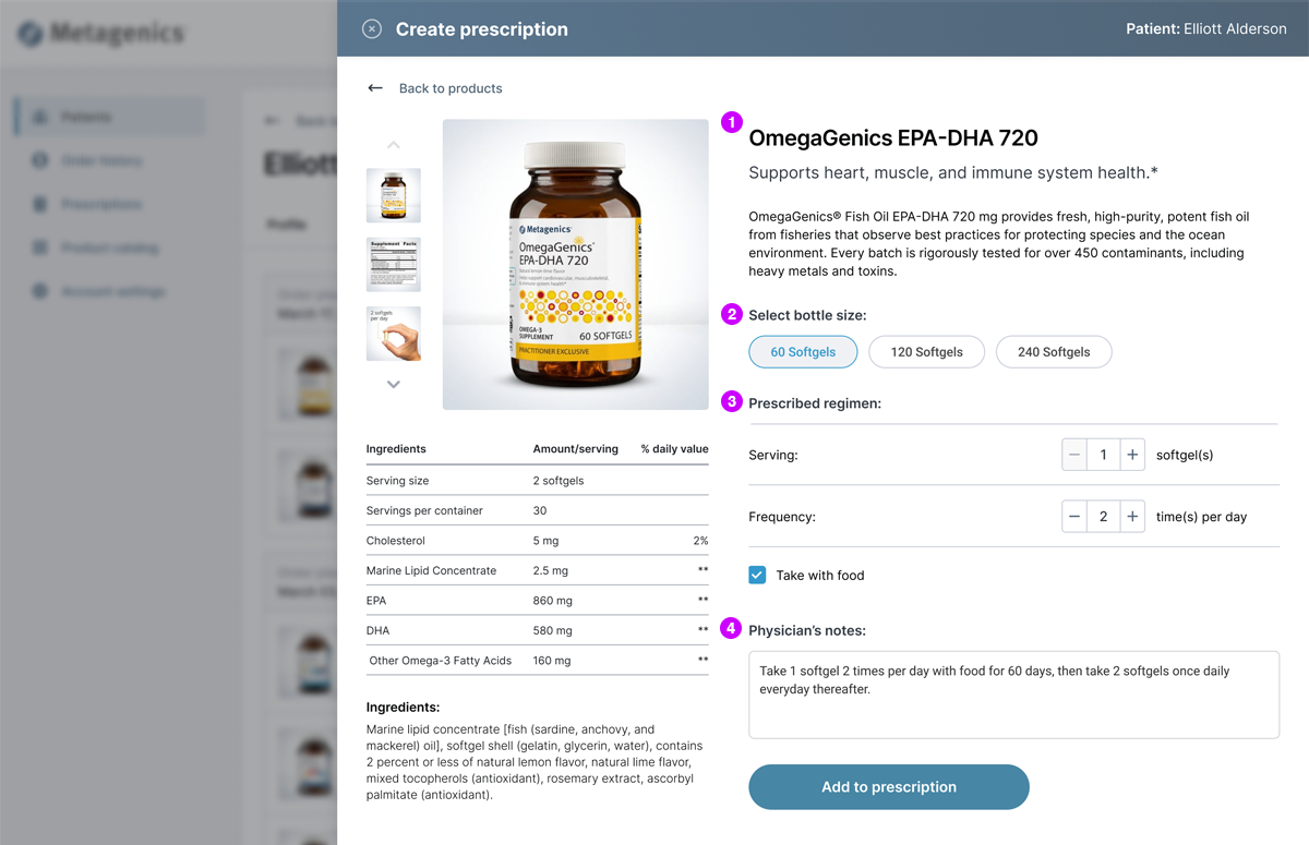
Product details
1Product description and ingredient facts.
2Physician selects recommended bottle size.
3Physician enters recommended serving size and frequency per day.
4Physician can enter additional notes for the patient.
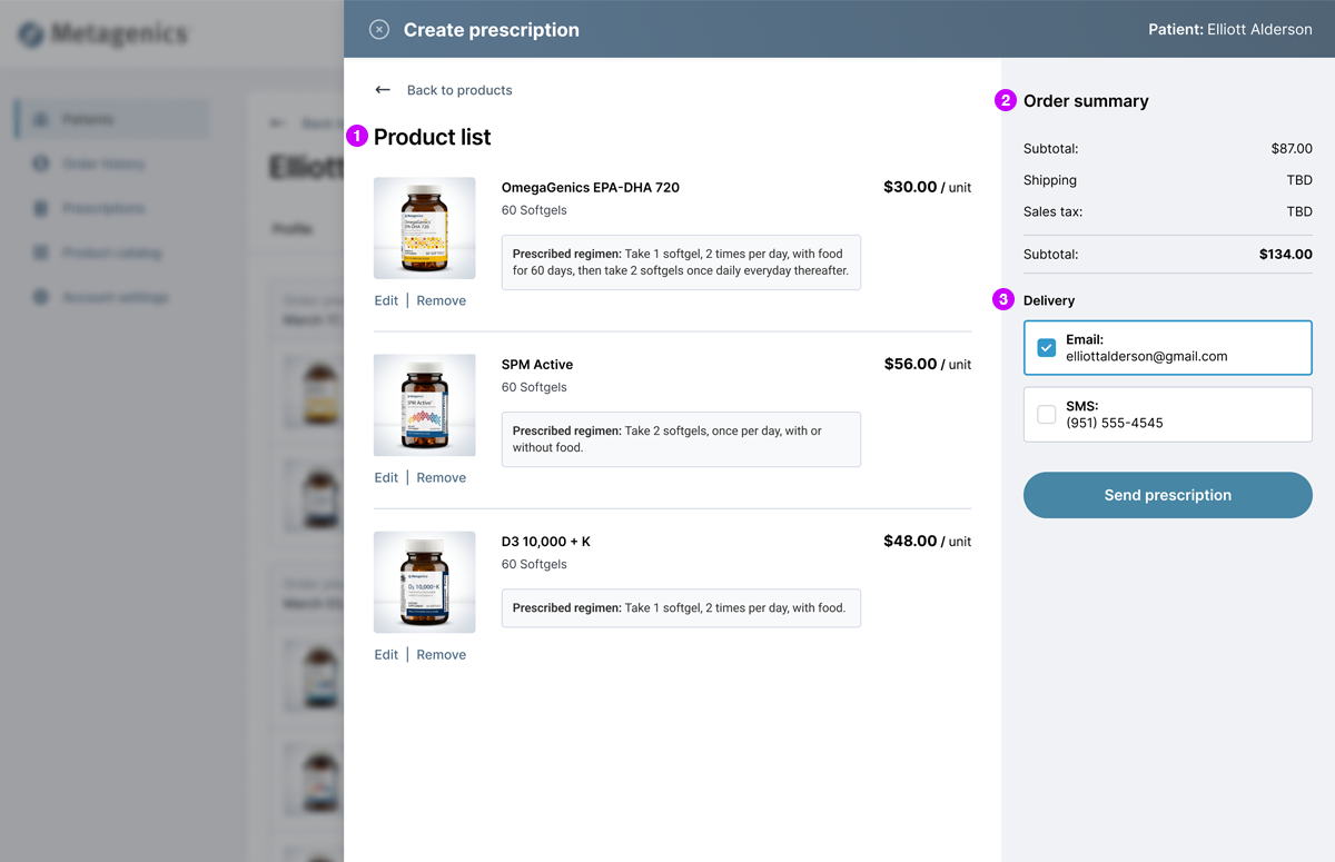
Summary
1List of all products the physician added to the patient prescription.
2Order summary shows price/unit and estimated subtotal.
3Physician can choose to deliver the prescription to the patient via email and/or SMS.
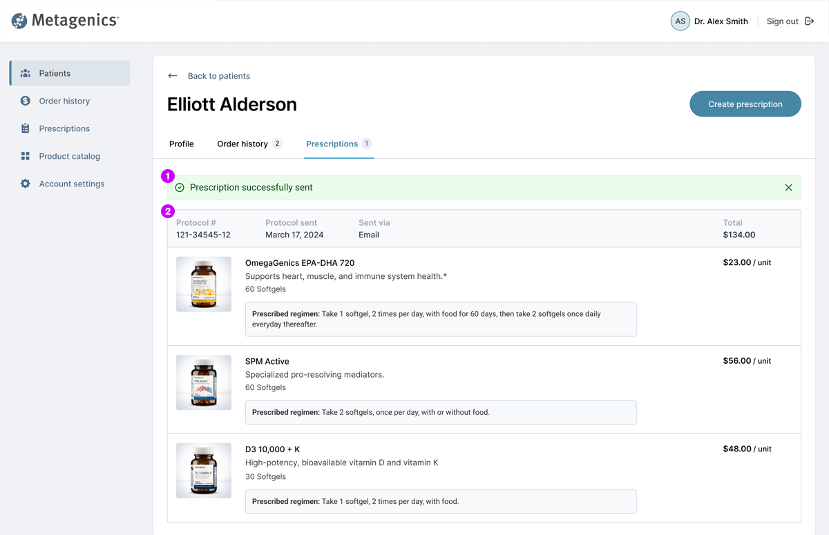
Confirmation
1Success message let's physician know their prescription has been sent to the patient.
2Prescription summary show all products physician has sent to the patient.
Making it responsive
Once the desktop experience was established, I then got to work on the mobile experience. To maintain a seamless, responsive experience, I leveraged flyout menus and sticky elements for primary CTAs to keep the user oriented in the mobile experience.
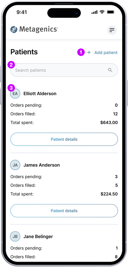
Patient list
1Physician can click "Add patient" to add new patients.
2Physician can easily search patients by name.
3Physician can view full list of patients, along with high-level metrics. "Patient details" allows them to drill in for more information.
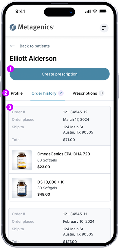
Patient details
1Physician can click "Create prescription" to initiate a new prescription for the patient.
2Tabs allow physician to view profile info, order history, and prescriptions.
3Physician can view all products purchased by the patient.
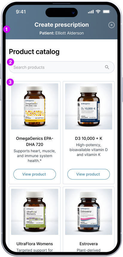
Product list
1Flyout keeps the user focued on creating the prescription.
2Physician can search products to quickly add to prescription.
3Physician can browse all products in catelog.
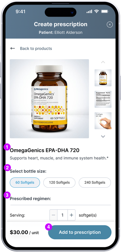
Product details
1Product description and ingredient facts.
2Physician selects recommended bottle size.
3Physician enters recommended serving size and frequency per day.
4Physician clicks CTA to add product to prescription.
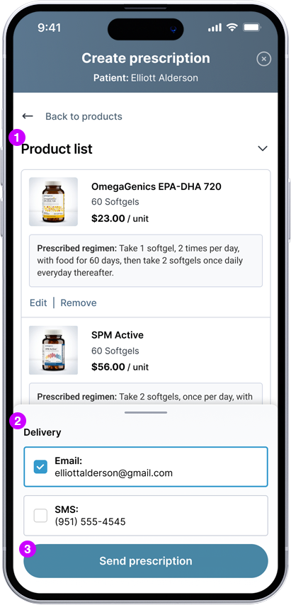
Summary
1List of all products the physician added to the patient prescription.
2Physician can choose to deliver the prescription to the patient via email and/or SMS.
3Physician clicks CTA to send prescription to the patient.

Confirmation
1Success message let's physician know their prescription has been sent to the patient.
2Prescription summary show all products physician has sent to the patient.

1Physician can click "Add patient" to add new patients.
2Physician can easily search patients by name.
3Physician can view full list of patients, along with high-level metrics. "Patient details" allows them to drill in for more information.

1Physician can click "Create prescription" to initiate a new prescription for the patient.
2Tabs allow physician to view profile info, order history, and prescriptions.
3Physician can view all products purchased by the patient.

1Flyout keeps the user focued on creating the prescription.
2Physician can search products to quickly add to prescription.
3Physician can browse all products in catelog.

1Product description and ingredient facts.
2Physician selects recommended bottle size.
3Physician enters recommended serving size and frequency per day.
4Physician clicks CTA to add product to prescription.

1List of all products the physician added to the patient prescription.
2Physician can choose to deliver the prescription to the patient via email and/or SMS.
3Physician clicks CTA to send prescription to the patient.

1Success message let's physician know their prescription has been sent to the patient.
2Prescription summary show all products physician has sent to the patient.
Back in the flow
For patients, a delightful checkout process was critical to improving patient adherence. The patient needed to see a list of the products recommended for them, along the ability to customize the bottle count and shipment frequency that best matches their individual needs. The overall objective was for the patient experience to seamlessly pick up where the physician left off.

More desktop designs
After creating the patient checkout flow, I then leveraged the UI components established for the physician experience while applying functionality that best meets the needs of the patient.
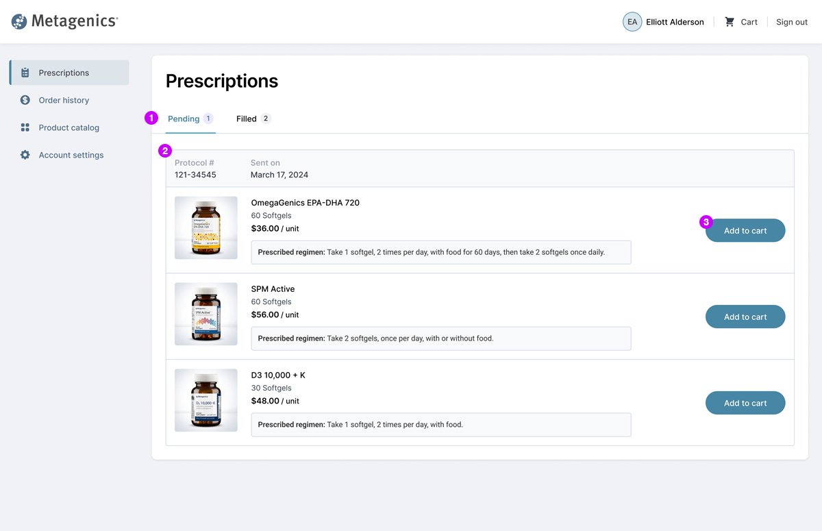
Prescription
1Tabs allow patient to view pending and filled and prescriptions.
2Product list shows regimen info and estimated price/unit.
3Patient chooses which items to add to their cart.
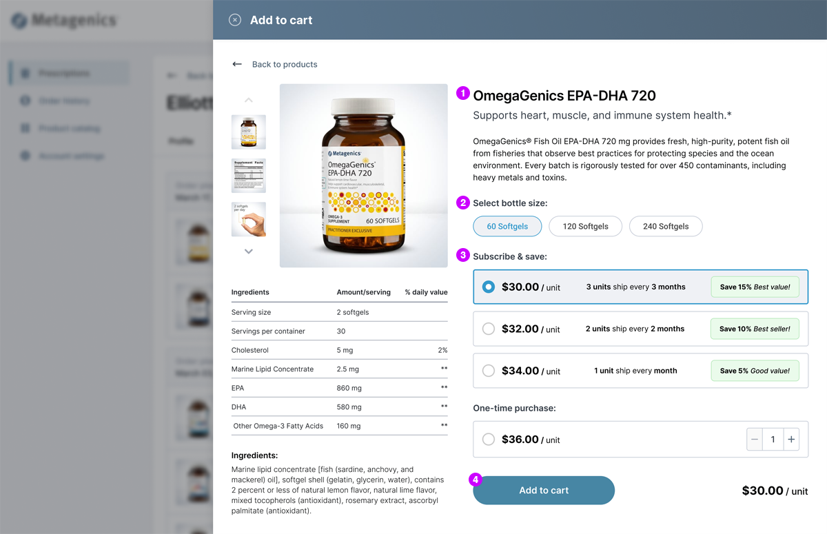
Product details
1Patient can see product description and ingredient facts to learn more about the product.
2Patient chooses the bottle size that best suits their needs.
3Patient chooses if they prefer to set up subscription or one-time order.
4Patient adds item to their cart.
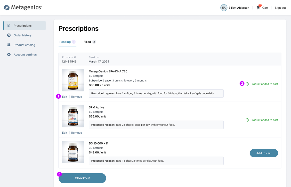
Order summary
1Patient can edit or remove product from their cart.
2Success message confirms each added item to the patient's cart.
3Patient clicks CTA once the they're ready to checkout.
Checkout
1Patient enters the address for product delivery.
2Patient enters payment information.
3List of all products with price/unit and order total.
4Patient clicks "Place order" to complete the transaction.

More responsive designs
Once the desktop experience was established, I then got to work on the mobile experience. To maintain a seamless responsive experience, I leveraged flyout menus and sticky elements for primary CTAs to keep the user oriented in the mobile experience.
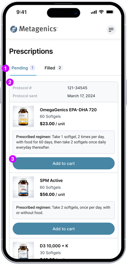
Prescription
1Tabs allow patient to view pending and filled and prescriptions.
2Product list shows regimen info and estimated price/unit.
3Patient chooses which items to add to their cart.
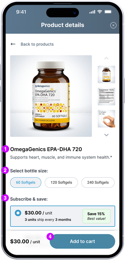
Product details
1Patient can see product description and ingredient facts to learn more about the product.
2Patient chooses the bottle size that best suits their needs.
3Patient chooses if they prefer to set up subscription or one-time order.
4Patient adds item to their cart.
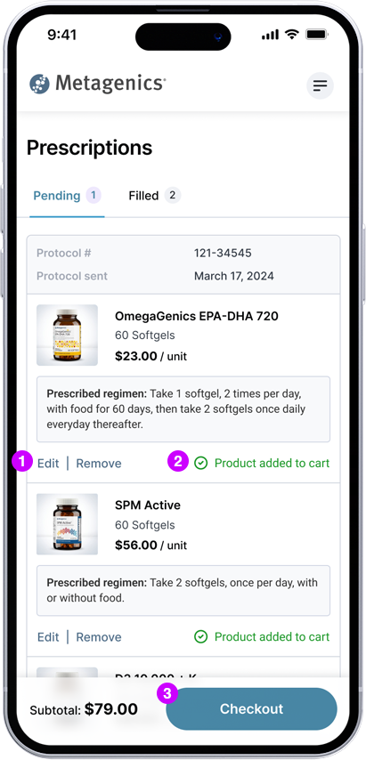
Order summary
1Patient can edit or remove product from their cart.
2Success message confirms each added item to the patient's cart.
3Patient clicks CTA once the they're ready to checkout.

Checkout
1Patient can expand order summary to view products.
3Patient enters the address for product delivery.
3Patient enters payment information.
4Patient clicks "Place order" to complete the transaction.

1Tabs allow patient to view pending and filled and prescriptions.
2Product list shows regimen info and estimated price/unit.
3Patient chooses which items to add to their cart.

1Patient can see product description and ingredient facts to learn more about the product.
2Patient chooses the bottle size that best suits their needs.
3Patient chooses if they prefer to set up subscription or one-time order.
4Patient adds item to their cart.

1Patient can edit or remove product from their cart.
2Success message confirms each added item to the patient's cart.
3Patient clicks CTA once the they're ready to checkout.

1Patient can expand order summary to view products.
3Patient enters the address for product delivery.
3Patient enters payment information.
4Patient clicks "Place order" to complete the transaction.


